


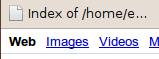
Screenshots of browsers without Arial
Bugs like this one, of the form "my fonts look bad, what do I do?" are frequently resolved like that one: nobody knows quite what's going wrong or what is to blame.
Here's an overview of what can go wrong with fonts in Google Chrome / Chromium on a Linux system, how to diagnose the problems, and how to fix them.
I've surely made some mistakes, so please let me know about them at
evan@chromium.org. (I'm especially interested in how KDE
handles things; I looked around online but couldn't find much.)
Many websites (including some you wouldn't expect, such as
ubuntuforums.org) only specify the page fonts in terms
of the quasi-free
Microsoft
Core fonts for the web. These fonts are available on Windows and
Mac OS X by default so many web designers assume they are always
available. In particular, some websites instruct the browser to use
Arial and will actually render improperly if you use any font that
doesn't match Arial exactly down to the size of each letter. Wishing
this were not the case does not make the problem go away.
There are two knobs to tweak when it comes to fonts. They are: (1) "Which font file do I use to render this text?" and (2) "What settings do I use to render this text?" As with many areas on Linux, there are multiple incompatible ways to configure all of this.
For (1), selection of fonts: older X apps like emacs use
Xresources. GTK apps use a GTK-specific font setting. Qt apps
use (XXX fill me in). Most newer systems (including GTK and Qt) also use the
fontconfig library to handle font fallback: which font to use when the
chosen font isn't available, or when it lacks the characters needed to render
the current text. Chrome, as a GTK app, should behave just like any other GTK
app in its user interface.
Because web pages themselves (via CSS) provide their own font fallback preferences, Chrome disregards the font fallback provided by fontconfig except when the fonts requested by the page don't provide the characters needed. (We believe this general goal is a feature, not a bug, but there are plenty of bugs in how Chrome implements this goal.)
For (2), how to render a selected font, things get more
complicated. Fontconfig allows per-font preferences; for example you
can configure it to say "for Courier New at sizes smaller than 12
points, do not perform any antialiasing". In contrast, GTK apps obey
the hopefully cross-desktop XSETTINGS
system (in particular its Xft/* settings). Typically that
is set up by the GNOME font preferences GUI
(System→Preferences→Fonts) via
gnome-settings-daemon. (Other systems like XFCE behave
similarly but with their own daemons.) It appears that settings
specified in Xresources propagate into GTK somehow;
it's not clear to me whether that's GTK directly or due to a settings
daemon.
For the UI, Chrome again behaves like every other GTK app. For web content, Chrome attempts to obey the fontconfig preferences. (Why? The system-wide preference is used to configure just one font, while a web browser displays a variety of fonts at different sizes.) These two settings can easily get out of sync: just change your font preferences via the GNOME GUI. Now fontconfig says one thing and GTK will say another. It may have been a mistake to obey fontconfig at all; I'm honestly not certain whether this was a good idea.
(In my brief testing Firefox appears to only obey fontconfig -- change the font settings in the control panel and Firefox doesn't reflect them -- but it also has maybe has its own set of font-display-related settings in about:config. I haven't investigated enough to see what actually happens. I wouldn't be surprised if it also varies across distros and versions.)
Different displays have pixels of different sizes, and ideally UIs would size themselves so that they appear the same size regardless of pixel size. You can learn what X thinks your display size is via:
$ xdpyinfo | grep dots
  resolution:    106x105 dots per inch
However, GNOME for whatever reason on my system is using a different DPI:
$ gconftool-2 -g /desktop/gnome/font_rendering/dpi
96
There's also the web conception of DPI: CSS provides a variety of units.
All of these units are nice in theory but in practice sites and apps only test at one DPI and break at others. WebKit hardcodes the DPI at 96; here's a bug where it is discussed, and Master of the Web Hyatt proclaims:
Web designers assume 96dpi. We have no choice but to use that as the default for absolute units.
The first Safari beta actually tried to use real DPI and the results were pretty disastrous. Not only did we mess up the rendering of a lot of Web sites, but a lot of prominent Web developers also blogged about our mistake and appealed to us to fix the problem (which we then did in beta #2).
Chrome's UI also currently hardcodes its size in terms of pixels. I think it wouldn't actually be too hard to fix this for the GTK theme; other Chrome themes, including the standard blue one, are specified in terms of images and aren't really scalable.
(Here is a page from Mozilla on the subject of DPI. But it mentions Xft which means it's probably out date.)
Now we'll take some screenshots of the Google home page and look into what's going wrong.
The above screenshots from Firefox and Chrome (ignoring the "blurriness" or not), with a too-wide "W" or weird spacing between letters, indicate you're falling back on a non-Arial font.
You can ask fontconfig to confirm:
$ fc-match -v Arial | egrep 'family'
	family: "Nimbus Sans L"(s)
Fix: install the Microsoft Core fonts. They are freely-available
(albeit not captial-F Free) in most Linux distributions with a package
name like msttcorefonts. (See Appendix
1 for a discussion what to do if you are unwilling to install these
fonts.)
In the above screenshot, the bookmark button (the top text, rendered via GTK in Chrome) is "sharp" or "too narrow" or "more Windows-like" while the bottom web text (from the Google home page) is "blurry" or "smooth" or "more Mac-like". This means that GTK and fontconfig aren't agreeing about how to render fonts. Whichever one you prefer is a personal choice, not an objective decision — don't let anyone try to tell you otherwise!
Both fonts are antialiased; the distinction here is how aggressive the hinting is. Hinting is when code snaps the edges of a font to the pixels on your screen. More hinting distorts the font to make it sharper-looking ("the Windows look"), while less hinting stays truer to the font form while making it blurrier ("the Mac look").
To see what hinting setting GTK is using, check the GNOME/XFCE/etc. font preferences. (Not using one of those desktop environments? See Appendix 2.)
To see what setting fontconfig is using, run a command like the following.
$ fc-match -v Arial | egrep 'family|hint'
	family: "Arial"(s)
	familylang: "en"(s)
	hintstyle: 1(i)(w)
	hinting: FcTrue(w)
	autohint: FcFalse(s)
The hintstyle of "1" means that fontconfig is using "light" hinting.
This is controlled by files under /etc/fonts. On
my Ubuntu system, there are symlinks that bring in settings like so:
$ readlink /etc/fonts/conf.d/10-hinting-slight.conf
/etc/fonts/conf.avail/10-hinting-slight.conf
As far as I know you must adjust these symlinks as root manually to
adjust fontconfig. (TODO: there must be some more official way to do
this, like via dpkg-reconfigure?) You can also merge files from
/etc into ~/.fonts.conf if you want to only change
settings for one user.
To summarize: you need to configure your hinting both via the control panel and via fontconfig. If you want them to match, verify the hint styles are the same.


TODO. (Does anyone have trouble with these? They're surely the same as hinting?)
Now for a bit of editorial.
It seems the two font configuration systems reflect the deeper schism with the Linux world. Fontconfig is the old style of Linux library: it allows complicated fiddling with font settings complete with its own XML-based programming language and sparse documentation. In contrast, the desktop environments via XSETTINGS provide a human-comprehensible easy to use GUI setting but the mechansim of how it is stored and applied is opaque.
Given the deep level that fontconfig is integrated at and that it provides important functionality (like script fallback), I don't think the second XSETTINGS system helps things ("Do you think I want to learn yet another editor?"). I read in one place that KDE just generates fontconfig files; with the disclaimer that I don't have a lot of knowledge about the design space, that seems to me like a reasonable way out.
I haven't much looked into DPI issues. People often claim that just making your UI in terms of vector graphics solves everything, but I am skeptical; people who know more about this stuff than me have been making pixel-based UIs since forever. And much like the core font issue, wishing sites would work properly won't fix them. I think the best we could do is allow a full-page zoom that scales everything up equally.
The Liberation fonts claim to be metric-compatible (that is, the exact same size as) some of the Microsoft Core fonts. As a single special case, if you do not have Arial installed, Chrome will allow falling back to Liberation Sans, and similarly for Times New Roman and Liberation Serif. I don't have much experience with these fonts so I can't vouch for whether they're well-hinted or if they fix all the display issues sites encounter. See this code review for links to bugs that have example problematic sites.
If you don't use GNOME/etc., you can change the GTK font via its configuration files but you cannot change the hinting settings there. Your best bet is to run xsettingsd, a daemon that implements enough of XSETTINGS to allow configuration. (It may be the case that without any XSETTINGS, GTK falls back on fontconfig's settings. Or maybe Xresources. TODO: confirm/deny this.)
Last edit: 28 Mar 2010.